Uni-variate Statistics
Uni-variate data is where we only consider the value of one variable. This is a variable in the MathymaStats sense, i.e it is something that can be measured, and therefore the value is represented by a real number (to some degree of accuracy), either positive or negative. It's a good idea to differentiate between a variable, a count (or frequency), and a factor (or categorical variable). Remeber: the value of a variable answers the question "how much?", a count - "how many?", and a factor "what type?", though be prepared to be flexible, as this is not a hard-and-fast definition.
Summarizing the data
To illustrate, we will consider an example of data where the abrasion coefficient of rubber has been measured on 30 samples.
To get basic statistics on any variable the mathyma.stats.DataBlock method "Summary" is used:
< script type="text/javascript" src="../Lib/MathymaStat.js" >< /script >
. . .
< script >
   var abrasionData = new mathyma.stats.DataBlock("StatsData/Abrasion.xml");
   abrasionData.ViewXML();
   abrasionData.AddVariables("Abrasion=ABR");
   abrasionData.Summary("Abrasion");
< /script >
This produces the following output:
If you examine the source XML data you will see that there is more than just abrasion for each observation. This will be used for further analysis below and in the section on multi-variate data.
Plotting the data
The mathyma.stats.DataBlock method "Plot" allows you to produce a variety of graphical output illustrating the data. Taking the above example on rubber abrasion
< script >
   abrasionData.Plot("Abrasion", true);
< /script >
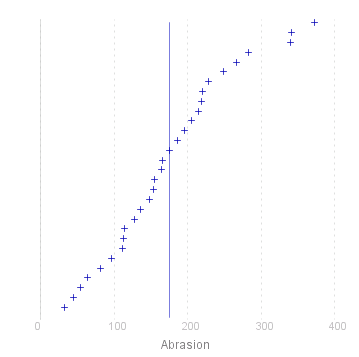
As you can see, when only one variable is plotted, the horizontal axis represents the value of the observation, and the values are distributed evenly along the vertical axis in ascending value, giving an empirical cumulate distribution function. The vertical line that crosses the plots indicate the mean values of the observations, and is only drawn if the second parameter (fit) is set to 'true'.
Categorized Data
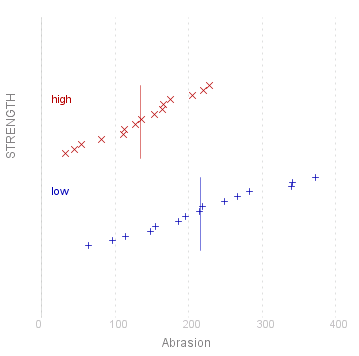
Now in addition to the measure of abrasion coefficient, each observation has also been categorised by the factor "Strength" which can have values "low" or "high"
< script >
   abrasionData.AddFactors("STRENGTH=STRENGTH:low,180,high");
   abrasionData.Summary("Abrasion");
   abrasionData.Plot("Abrasion/STRENGTH", true);
< /script >
This produces the following output:
 |
Univariate Diagrams
The mathyma.stats.DataBlock method Plot calculates the position of each observation and prints this on the graph. For large numbers of observations this can require a lot of computing resource , and lead to poor performance. There are alternative drawing methods which are more appropriate in these cases
As an example we will look at the measurment of height og men (in inches) in the four countries of the British Isles, Wales, Ireland, England and Scotland
< script >
   var heightData = new mathyma.stats.DataBlock("StatsData/HeightCountry.xml");
   heightData.ViewXML();
   heightData.AddVariables("Height=HEIGHT");
   heightData.AddFactors("Country=LAND");
   heightData.DefineCount("COUNT");
   heightData.Summary("Height");
< /script >
This produces the following output:
First here is the result of a Plot
< script >
   heightData.Plot("Height/Country");
< /script >
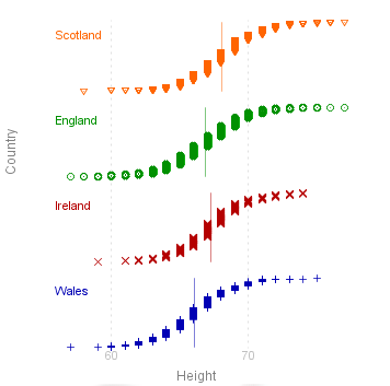
This graph gives a fair idea of the distribution of the values, but it was very slow producing the plot - there are 8585 values to plot after all.
Empirical Distribution Function
Nearly the same information can be gleaned from the empirical (cumulative) distribution function:
< script >
   heightData.CDF("Height/Country");
< /script >
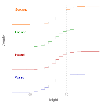
Here the graph for each value shows what proportion of the observations have a value less than or equal to the given value. The graph varies between 0 (left) and 1 (right). The height of each step is proportional to the number of observations that have that value
Box-Plots
A much simpler summary of the data is a box-plot. Here the box indicates the "inter-quartile" range: i.e the left of the box is the lower quartile (25% of observations have a value less than this), the right being the upper quartile (75%). The vertical line across the box is the median (50%), and the horizontal lines to each side of the box ("cat's whiskers") indicate the full range of the observed values.
< script >
   heightData.BoxPlot("Height/Country");
< /script >
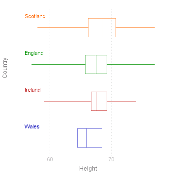
Box plots are quite popular on introductory statistics courses, presumably because they are quite easy to draw. In themselves they give no information that is not given in the summary table, but are very useful to gain a quick comparison of the data on different levels of a factor.
Histograms
Another very popular way of displying the data is the histogram. The Histogram method draws a histogram of the variable for each level of the given factor:
< script >
   heightData.Histogram("Height/Country",1,60);
< /script >
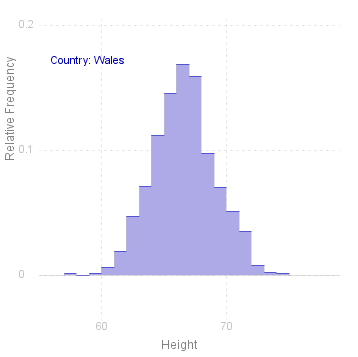 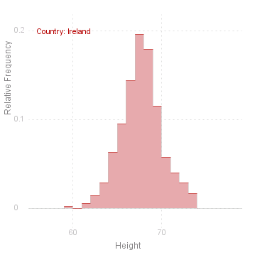 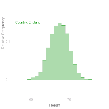 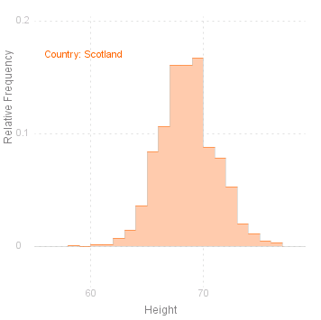 |
Note that there are two additional parameters for Histogram: the first defines the length of the intervals to be used in the Histogram, the second is a reference point, i.e. some point which should be the boundary between two intervals. If the length of the interval (parameter 2) is not given, then the interval is defined as one tenth of the range. If reference point (parameter 3) is not given, then the minimum value of the variable is taken as the fixed point.
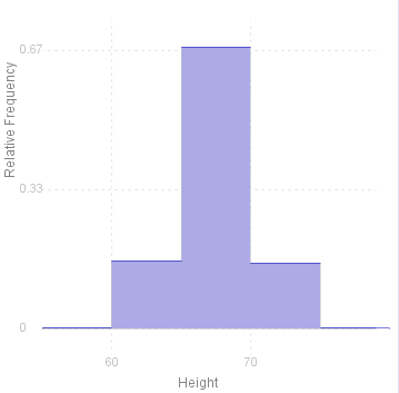
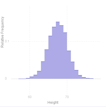
To see how changing the interval affects the histogram, here are two examples using the same data as above (however not here factorised by country), first with an interval of 5 (inches) and secondly with an interval of 1 inch (note that there is no point trying to define an interval finer than this as the measurements are only to the nearest inch in any case).
< script >
   heightData.Histogram("Height",5,60);
   heightData.Histogram("Height",1,60);
< /script >
  |
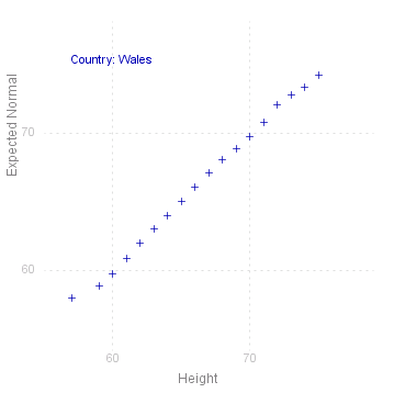
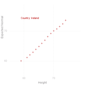
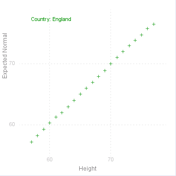
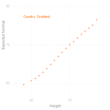
Normal Plot
A common requirement for uni-variate data is to see if the values are normally distributed. This is traditionally done by drawing the empirical distribution (as points) on a normal scale, i.e where the vertical axis is "stretched" according to the normal or Gaussian distribution.
MathymaStats does an equivalent plot, taking the cumulates for each value\ ( 1/~n, 2/~n , ... , ~n/~n , _ with jumps if there are grouped values )
and calculating the inverse normal values ( NormInv ) for these cumulates, using the empirical mean and standard deviation. This is done for the given variable for each level of the given factor:
If the values are perfectly normally distributed, then they will fall on the 45° diagonal passing through the origin. The closer to this line the points are, the greater the likelihood that they come from a normal distribution.
Note that to do a normal plot you must also include the MathymaDistr module:
< script type="text/javascript" src="../Lib/MathymaStat.js" >< /script >
< script type="text/javascript" src="../Lib/MathymaGraph.js" >< /script >
< script type="text/javascript" src="../Lib/MathymaDistr.js" >< /script >
. . .
< script >
   heightData.NormalPlot("Height/Country");
< /script >
    |
Source for the graphs shown on this page can be viewed by going to the diagram capture page .